
Case Study · Web / iPad App
Case Study · Web / iPad App
Earture - On Site (Ear Testing)
Earture - On Site (Ear Testing)
A website/tab app for on-site hearing tests, conducted at the client’s facility by a CAOHC-certified technician.
A website/tab app for on-site hearing tests, conducted at the client’s facility by a CAOHC-certified technician.
Role
Role
Product Designer
Product Designer
Timeline
Timeline
12 Weeks
12 Weeks
Platform
Platform
Web · iPad App
Web · iPad App
Problem
Problem
The existing system made it difficult for technicians to manage ongoing tests due to a fragmented and unintuitive flow. Users struggled to initiate tests, track progress, and handle multiple participants efficiently, often relying on manual intervention. This led to delays, increased errors, and reduced operational efficiency during on-site testing.
The existing system made it difficult for technicians to manage ongoing tests due to a fragmented and unintuitive flow. Users struggled to initiate tests, track progress, and handle multiple participants efficiently, often relying on manual intervention. This led to delays, increased errors, and reduced operational efficiency during on-site testing.
Outcome
Outcome
Redesigned the system to streamline the entire testing workflow into a structured, step-by-step experience. Introduced a centralized interface to manage tests, participants, and calibration in one place, reducing dependency on manual coordination. This improved task efficiency, reduced user confusion, and enabled technicians to conduct tests more reliably and independently.
Redesigned the system to streamline the entire testing workflow into a structured, step-by-step experience. Introduced a centralized interface to manage tests, participants, and calibration in one place, reducing dependency on manual coordination. This improved task efficiency, reduced user confusion, and enabled technicians to conduct tests more reliably and independently.
My Research Approach
My Research Approach
How I gathered insights:
I wasn’t able to speak with technicians directly during live sessions given the operational constraints of on-site testing. Instead, I structured questionnaires sent through stakeholders to capture real pain points from the people using the system daily. 6 out of 8 technicians reported difficulty initiating tests - that signal was strong enough to anchor the entire redesign around flow clarity and reducing manual intervention. This indirect research made me more deliberate about validating assumptions through the design itself, using progressive disclosure and visible status indicators to reduce the guesswork technicians were already compensating for.
I wasn’t able to speak with technicians directly during live sessions given the operational constraints of on-site testing. Instead, I structured questionnaires sent through stakeholders to capture real pain points from the people using the system daily. 6 out of 8 technicians reported difficulty initiating tests - that signal was strong enough to anchor the entire redesign around flow clarity and reducing manual intervention. This indirect research made me more deliberate about validating assumptions through the design itself, using progressive disclosure and visible status indicators to reduce the guesswork technicians were already compensating for.
1.
Technicians struggle to initiate tests due to a confusing flow.
6 out of 8 technicians reported difficulty starting tests with the current interface, finding the flow unintuitive and frustrating. New technicians often express concerns about the outdated design, which lacks clear navigation and user-centric elements.
6 out of 8 technicians reported difficulty starting tests with the current interface, finding the flow unintuitive and frustrating. New technicians often express concerns about the outdated design, which lacks clear navigation and user-centric elements.
2.
High learning curve for new technician onboarding.
Training new technicians is time-consuming, as adapting to the complex interface takes longer than expected. The design needs to be simplified, with a straightforward flow that allows users with minimal hearing test knowledge to navigate the app effortlessly.
Training new technicians is time-consuming, as adapting to the complex interface takes longer than expected. The design needs to be simplified, with a straightforward flow that allows users with minimal hearing test knowledge to navigate the app effortlessly.
3.
Fragmented screens make participant management stressful.
Proctors face unnecessary stress managing participant data in real time, as they need to switch between multiple screens. Consolidating participant management and testing onto a single, unified screen would reduce cognitive load and streamline the process.
Proctors face unnecessary stress managing participant data in real time, as they need to switch between multiple screens. Consolidating participant management and testing onto a single, unified screen would reduce cognitive load and streamline the process.
4.
Lack of visual hierarchy and feedback during testing.
Technicians reported that the interface lacked clear visual indicators for test progress, errors, or system status. Without real-time feedback or status cues, users were unsure whether actions were successful, leading to unnecessary interruptions and reliance on external support. Introducing visual cues, progress indicators, and error states would improve clarity and reduce uncertainty.
Technicians reported that the interface lacked clear visual indicators for test progress, errors, or system status. Without real-time feedback or status cues, users were unsure whether actions were successful, leading to unnecessary interruptions and reliance on external support. Introducing visual cues, progress indicators, and error states would improve clarity and reduce uncertainty.
What this changed in my approach
What this changed in my approach
These insights revealed that the issue wasn’t just visual complexity, but lack of system guidance and workflow clarity. This shifted my focus from improving UI elements to restructuring the overall experience to better support task flow and decision-making.
These insights revealed that the issue wasn’t just visual complexity, but lack of system guidance and workflow clarity. This shifted my focus from improving UI elements to restructuring the overall experience to better support task flow and decision-making.
Why I made this call
Why I made this call
The decision to unify Calibration + Seat Assignment into a single view wasn’t aesthetic, it was operational.
The decision to unify Calibration + Seat Assignment into a single view wasn’t aesthetic, it was operational.
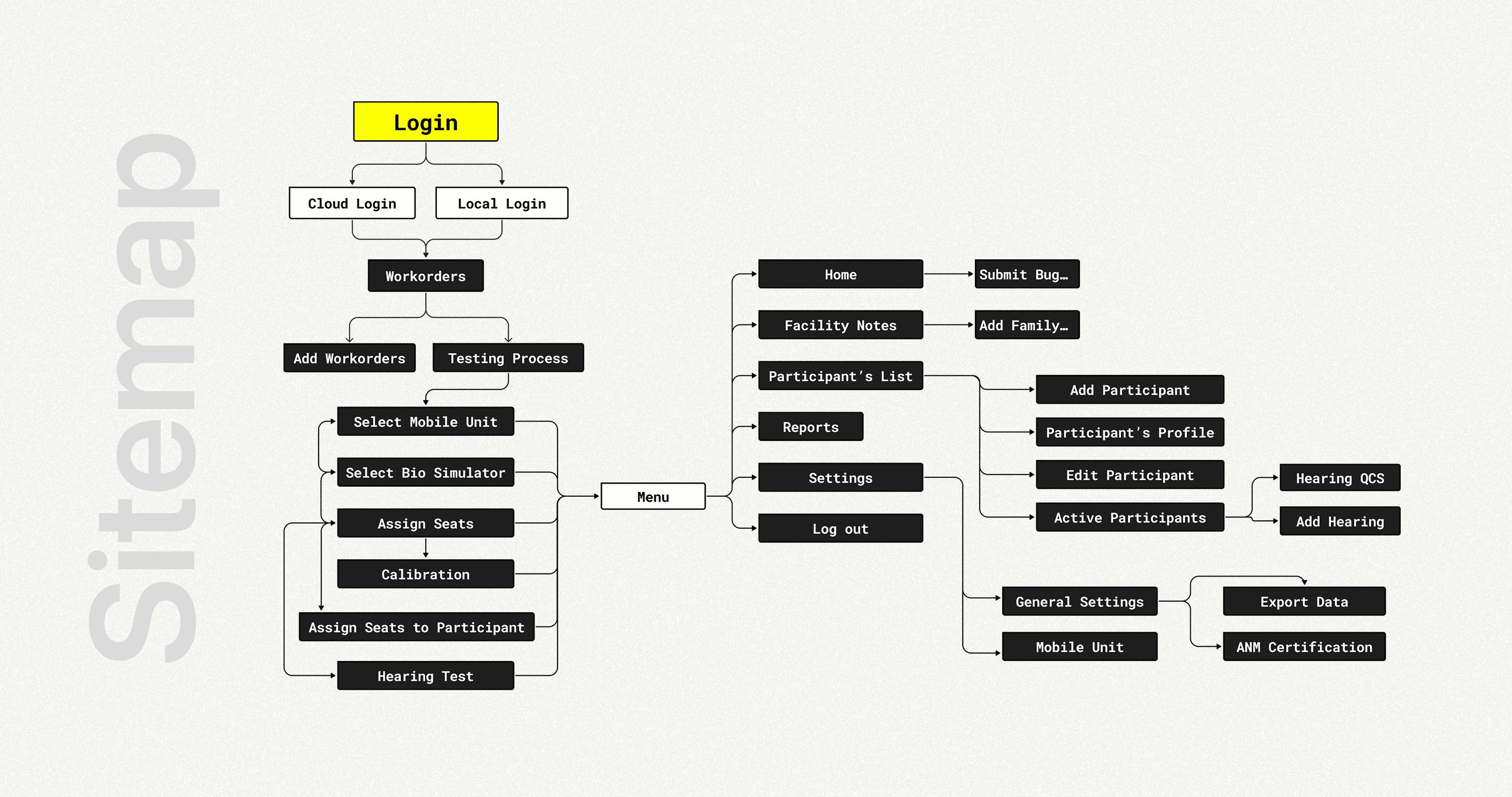
In the old flow, technicians had to context-switch between screens mid-session while participants were already seated. This created moments where a technician would lose their place or re-calibrate unnecessarily. By consolidating these steps into one progressive interface with real-time seat status, I removed the need to hold information in short-term memory. The step-by-step sidebar (Select Mobile Unit → Bio Simulator → Assign Seats → Calibration) wasn’t just easy to navigate, it was a cognitive offload tool for technicians managing 8 people at once in a time-pressured environment.
In the old flow, technicians had to context-switch between screens mid-session while participants were already seated. This created moments where a technician would lose their place or re-calibrate unnecessarily. By consolidating these steps into one progressive interface with real-time seat status, I removed the need to hold information in short-term memory. The step-by-step sidebar (Select Mobile Unit → Bio Simulator → Assign Seats → Calibration) wasn’t just easy to navigate, it was a cognitive offload tool for technicians managing 8 people at once in a time-pressured environment.
Divided 90% of the testing process into 4 step by step process and made the flow simpler with better ui and intuitive user experience with clear instructions.
Divided 90% of the testing process into 4 step by step process and made the flow simpler with better ui and intuitive user experience with clear instructions.

Highlights of the Design
Highlights of the Design
Calibration Process
Calibration Process

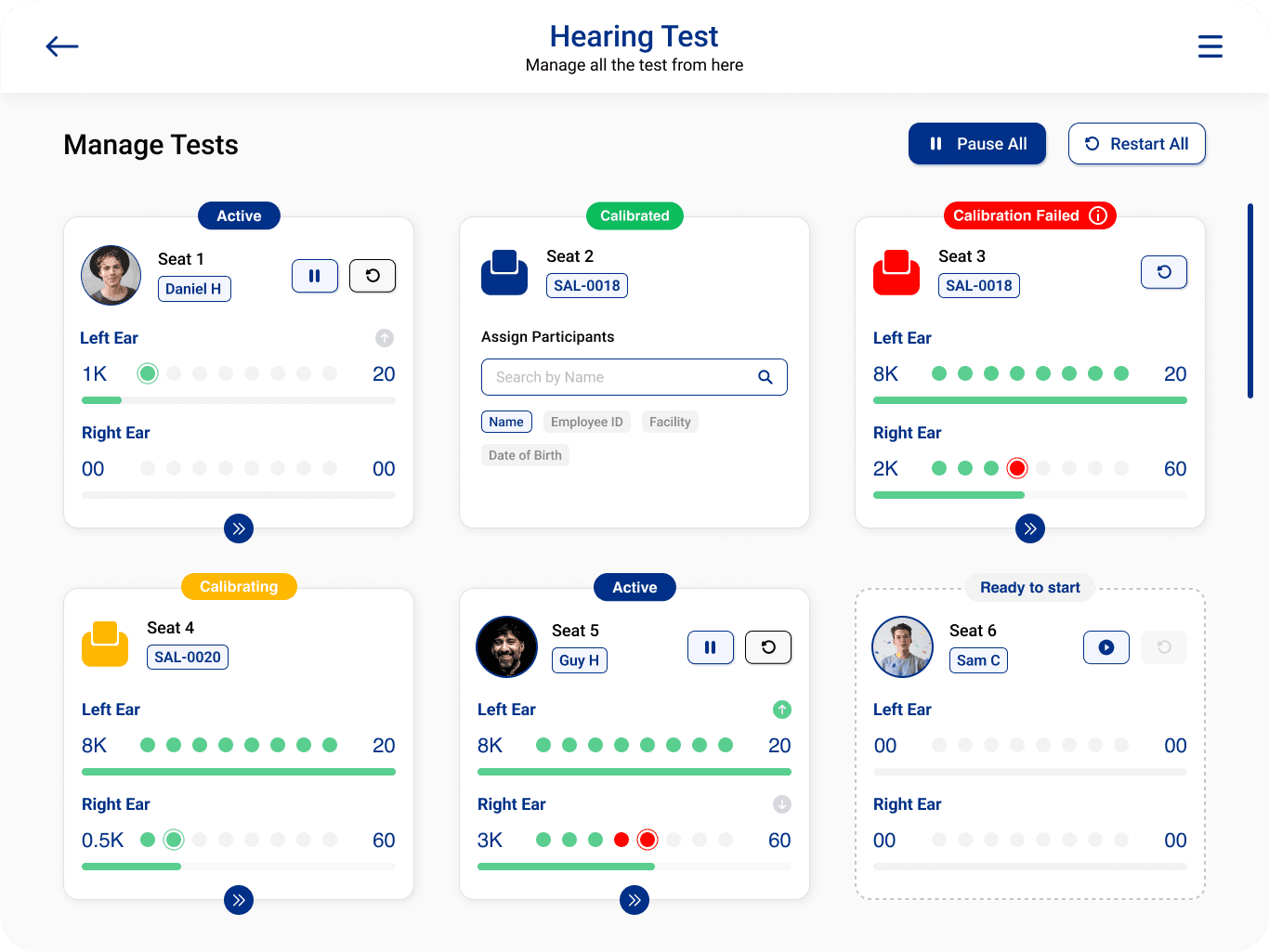
Hearing Test and Management
Hearing Test and Management
Everything in one screen. Technicians can manage seats, check test status, and handle calibration issues without jumping between views. No switching, no losing your place.
Everything in one screen. Technicians can manage seats, check test status, and handle calibration issues without jumping between views. No switching, no losing your place.

Assigning Seats with Calibration
Assigning Seats with Calibration
Assign participants to seats and see calibration status at a glance. Seats that need attention are flagged visually so technicians can act on them without leaving the view. No hunting, no guessing.
Assign participants to seats and see calibration status at a glance. Seats that need attention are flagged visually so technicians can act on them without leaving the view. No hunting, no guessing.

Collapsed view for the seats section
Collapsed view for the seats section
Technicians can search and assign participants easily with more space
Technicians can search and assign participants easily with more space

Assigning Seats to Participants and Testing Process
Assigning Seats to Participants and Testing Process
Effortlessly oversee and manage multiple testing processes from a unified, single-page interface. This streamlined approach allows you to organize participants, monitor seat assignments, and handle test statuses in real time. Additionally, you can manage errors, conduct calibrations, and ensure all test stations are ready. All within the same view for optimal efficiency.
Effortlessly oversee and manage multiple testing processes from a unified, single-page interface. This streamlined approach allows you to organize participants, monitor seat assignments, and handle test statuses in real time. Additionally, you can manage errors, conduct calibrations, and ensure all test stations are ready. All within the same view for optimal efficiency.
Information architecture
Information architecture
Proctor and technician flow, mapped before final UI.
Proctor and technician flow, mapped before final UI.
Business Impact
Business Impact
Business Impact
Business Impact
This redesign directly affected the speed and reliability of on-site hearing test operations across 20–50 technicians managing sessions with up to 8 participants simultaneously
This redesign directly affected the speed and reliability of on-site hearing test operations across 20–50 technicians managing sessions with up to 8 participants simultaneously
Operational efficiency:
Operational efficiency:
Session setup time dropped from approximately 20 minutes to under 10 minutes - a ~50% reduction. For a technician running 6-8 back-to-back sessions in a single site visit, this compounds to over an hour of recovered time per day, enabling more sessions per visit or earlier wrap-up at client sites.
Session setup time dropped from approximately 20 minutes to under 10 minutes - a ~50% reduction. For a technician running 6-8 back-to-back sessions in a single site visit, this compounds to over an hour of recovered time per day, enabling more sessions per visit or earlier wrap-up at client sites.
Error reduction:
Error reduction:
The introduction of real-time calibration status per seat (Calibrated / Needs Calibration / Error) eliminated a class of silent failures - where technicians would proceed without knowing a device was misconfigured. This directly reduces the risk of invalid test results, which in occupational health have compliance and legal implications for the client.
The introduction of real-time calibration status per seat (Calibrated / Needs Calibration / Error) eliminated a class of silent failures - where technicians would proceed without knowing a device was misconfigured. This directly reduces the risk of invalid test results, which in occupational health have compliance and legal implications for the client.
Technician independence:
Technician independence:
The structured step-by-step workflow reduced reliance on supervisor intervention during onboarding. New technicians previously needed guidance to navigate the fragmented interface; the redesigned flow was self-guiding by design.
The structured step-by-step workflow reduced reliance on supervisor intervention during onboarding. New technicians previously needed guidance to navigate the fragmented interface; the redesigned flow was self-guiding by design.
Scalability signal:
Scalability signal:
The centralized participant management view (collapsible seat sections, inline search, real-time status) was built to handle variable session sizes from small 2-seat setups to full 8-seat configurations without changing the interaction model. This makes the system usable across different client facility sizes without retraining.
The centralized participant management view (collapsible seat sections, inline search, real-time status) was built to handle variable session sizes from small 2-seat setups to full 8-seat configurations without changing the interaction model. This makes the system usable across different client facility sizes without retraining.
Highlight of Old Designs
Highlight of Old Designs
with cluttered ui and non functional ux
with cluttered ui and non functional ux



Login & Workorder Management:
Login & Workorder Management:
Both local and cloud login. Technicians can pull in their workorders and get started without any setup friction.
Both local and cloud login. Technicians can pull in their workorders and get started without any setup friction.
Participant Onboarding & Test Monitoring:
Participant Onboarding & Test Monitoring:
Add participants, assign seats, and track status in real time. Calibration indicators are visible throughout so technicians always know where each seat stands.
Add participants, assign seats, and track status in real time. Calibration indicators are visible throughout so technicians always know where each seat stands.
Homescreen Data & Live Updates:
Homescreen Data & Live Updates:
The home screen surfaces what matters - active sessions, notifications, and participant progress. Coordinators can see what needs attention without digging.
The home screen surfaces what matters - active sessions, notifications, and participant progress. Coordinators can see what needs attention without digging.
Testing & Analytics
Testing & Analytics
Technicians can run multiple participants at once, track each one’s progress, and pull up historical test data - all from the same view.
Technicians can run multiple participants at once, track each one’s progress, and pull up historical test data - all from the same view.
Final Designs
Final Designs
with Streamlined and Scalable User Flows
with Streamlined and Scalable User Flows
The flows were rebuilt from the ground up. Login, setup, testing - each step is direct and in the right order. Everything a technician needs to run a session is in one place now.
The flows were rebuilt from the ground up. Login, setup, testing - each step is direct and in the right order. Everything a technician needs to run a session is in one place now.

What I’d do Differently
What I’d do Differently
I’d also want to measure task completion rates post-launch, specifically: time-to-first-test-started per session, and frequency of calibration restarts. The design reduces obvious friction, but whether technicians are actually using the collapsed seat view or ignoring it is something only usage data can tell you.
I’d also want to measure task completion rates post-launch, specifically: time-to-first-test-started per session, and frequency of calibration restarts. The design reduces obvious friction, but whether technicians are actually using the collapsed seat view or ignoring it is something only usage data can tell you.
The trade-off I made: adding navigation steps in exchange for clarity - was the right call for experienced users, but I’d want to validate it doesn’t create anxiety for brand new technicians seeing the flow for the first time
The trade-off I made: adding navigation steps in exchange for clarity - was the right call for experienced users, but I’d want to validate it doesn’t create anxiety for brand new technicians seeing the flow for the first time