
Case Study · IOS · Android
Sign Speak (AI Sign Language App)
An AI translation app that lets a Deaf student in Berlin order coffee, talk to a doctor, and ask for help - without writing it down first.
Role
Product Designer
Timeline
2024-2025
Academic Context
Master's project · UCA × BSBI 2025 · Jury of 3 · Grade 1.8
Tools
Figma · Miro · Illustrator · Photoshop
Problem
Communication is still gated by who else happens to sign. 470 million Deaf and hard-of-hearing people. Most hearing people don't sign. Most public spaces don't have interpreters. Existing apps cover slivers of the problem - single sign language, no real-time mode, no emergency path. No single product does DGS-first real-time translation, an emergency SOS that doesn't require speech, and a community learning hub in one place.
Outcome
A 5-tab mobile app: DGS-first translation (Sign↔Text under 3 seconds with confidence shown), a Sign↔Text reverse flow so hearing people can speak back without knowing sign, a one-tap emergency SOS designed for the moment speech is not an option, and a Deaf-community learning hub. 90+ screens, a component-driven design system, and five UX laws mapped to five concrete design decisions.
Two are demographic - the size of the population being underserved. Two are product-shaped - the specific failure modes of the apps that already exist. Each one drove a different design move.
Demographic · Scale
WHO data: 470 million people live with disabling hearing loss today, projected to reach ~900 million by 2050 - roughly 1 in 10 people. Existing apps treat them as a niche.
DGS-first language strategy · Designed for the German Deaf community first, not as an ASL afterthought
Product · Coverage gap
Audit of four leading apps (Hand Talk, ProDeaf, Signily, Google Interpreter Mode): none combine real-time DGS translation, an emergency SOS, and a learning community. Users currently stitch together 3+ tools.
One 5-tab app · Translate, Learn, Connect, SOS, Profile - each tab does one job clearly
Failure mode · Emergency
One-tap SOS with 1-second hold · pre-written status, location opt-in, haptic confirm - confirm-and-send not compose-and-send
Failure mode · Language
DGS as the default · ASL as opt-in, never the assumption. Confidence shown on every translation so the user can judge it.
MY RESEARCH APPROACH
A research-first foundation, openly limited.
No primary interviews ran inside the project window. Every persona, statistic, and design rationale traces back to a cited secondary source - listed below and again at the end.
I could not recruit Deaf participants for primary interviews within the project window. Findings and personas are synthesised from peer-reviewed research, public Deaf-community forums, and published reports - all cited inline. The personas in the next chapter are explicitly labelled as composites, not real interviewees.
THE FOUR RESEARCH THREADS
01
Secondary literature.
Peer-reviewed research on Deaf communication and access. Themes: mis-triage of Deaf patients in healthcare, interpreter shortages in EU emergency services, lip-reading fatigue, ASL-default assumption-cost when local sign languages differ grammatically. (McKee 2015, Sharma & Gupta 2022)
02
Population data.
WHO + WFD reports - 470M today, ~900M projected by 2050, persistent education gap with hearing peers. The scale that justified building a serious product, not a demo.
03
EU communication gaps.
EUD barriers report - informed the DGS-first decision and the emergency flow design. Made it clear that ASL-by-default would silently fail the German market the project is for.
04
Competitive audit.
Hand Talk · ProDeaf · Signily · Google Interpreter Mode. None combined real-time DGS translation, emergency support, and a Deaf-community learning hub in a single product.

WHAT THIS CHANGED IN MY APPROACH
The research reframed the project from "another sign-language translator" into a three-job product - translate, emergency, community - built as an AI-translation-first app. Everything that follows is downstream of that reframing.
Used Claude for literature synthesis across the four research threads, competitive audit structuring, and persona drafting - always cross-checked against the cited sources. Figma AI used for component-naming consistency and accelerated variant production. Every design decision is mine; AI tools accelerated research and asset production, not judgment calls.
Three users. Three risks. One product.
Composites synthesised from the four research threads above. Each persona maps to a distinct top-risk in the product - and to a distinct design response.
Klaus · 68
Retired engineer · Munich · Late-deafened
TOP RISK
Doctor talking past him
“When I lost my hearing the worst part wasn’t silence - it was watching a doctor talk past me to my wife.”
Paraphrased · McKee et al. 2015
Failure mode
New apps overwhelm; emergencies leave him voiceless; UI text too small.
Design response
Big tap targets, high contrast, one-tap SOS, speech-to-text card to hand a doctor.
Gideon · 26
Engineer · Hamburg · Profoundly Deaf, DGS
TOP RISK
Typing his name to a paramedic
“I shouldn’t have to type my own name to a paramedic. The technology to sign it exists - the design choice not to use it is the problem.”
Paraphrased · WFD 2021; EUD 2022
Failure mode
Voice/text-only translators; public signage assumes hearing; manual typing in emergencies feels unsafe.
Design response
Pre-written status. One-tap SOS. Open accessibility standards. Offline fallback for the SOS path.
Emma · 22
Student · Berlin · DGS-first
TOP RISK
Mis-triage in lectures
“When apps assume ASL, they assume my world looks like the US. It doesn’t. DGS has its own grammar - I want my tools to know that.”
Paraphrased · EUD 2022; Sharma & Gupta 2022
Failure mode
ASL-default tools strip out signing nuance; written-only chat removes emotional tone.
Design response
DGS as the default. Real-time captions in lectures. Chat preserves signing-tone metadata where possible.
When I need to communicate across the hearing/Deaf divide - for everyday conversations or for an emergency - give me a tool that respects DGS as a real language and doesn't make me prove I deserve to be understood.
Quotes are illustrative - paraphrased from cited sources, not transcribed from real interviewees.
Five tabs. One clear job each.
The IA was defined before any screen design. Five tabs were established early - Translate, Learn, Connect, SOS, Profile - and held through all iterations. Every screen exists to serve one of these five jobs.
The app supports translation across multiple sign languages - DGS is the default for the German market, with ASL, BSL, ISL, and others available as opt-in.

01
Translate
Sign↔Text real-time, with confidence shown. Most-used flow. ~70% of session time.
02
Learn
Practice cards, saved translations, community-sourced signs across sign languages.
03
Connect
Chat that preserves signing tone; group chat for Deaf-led communities.
04
SOS
One-tap emergency, designed for the moment speech is not an option.
05
Profile
Trusted contacts, pre-written status, accessibility prefs.
THE TRANSLATION PRINCIPLES
PRINCIPLES MADE SPECIFIC
Listing UX laws on a portfolio is easy. Showing where they made a decision is the hard part.

AI CAPABILITY DESIGN
Designing for AI, not around it.
Sign Speak runs on a real-time translation model. That model has confidence, latency, and failure modes - and the UI surfaces all three on purpose. Four design rules came out of treating the model as part of the experience, not a hidden backend.
Pill turns teal at 90%+, amber below it with a "Best guess:" prefix. The user always sees what the model is sure about - and what it isn't.
IDEATION & VISUAL DIRECTION
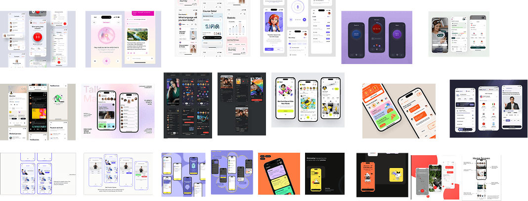
Visual direction, set before wireframing.
Three commitments locked the visual language early - teal as a trust signal, high contrast everywhere, and no decorative complexity. Mapping each design decision back to a UX law made the choices defensible to a non-design jury.
WIREFRAMES →
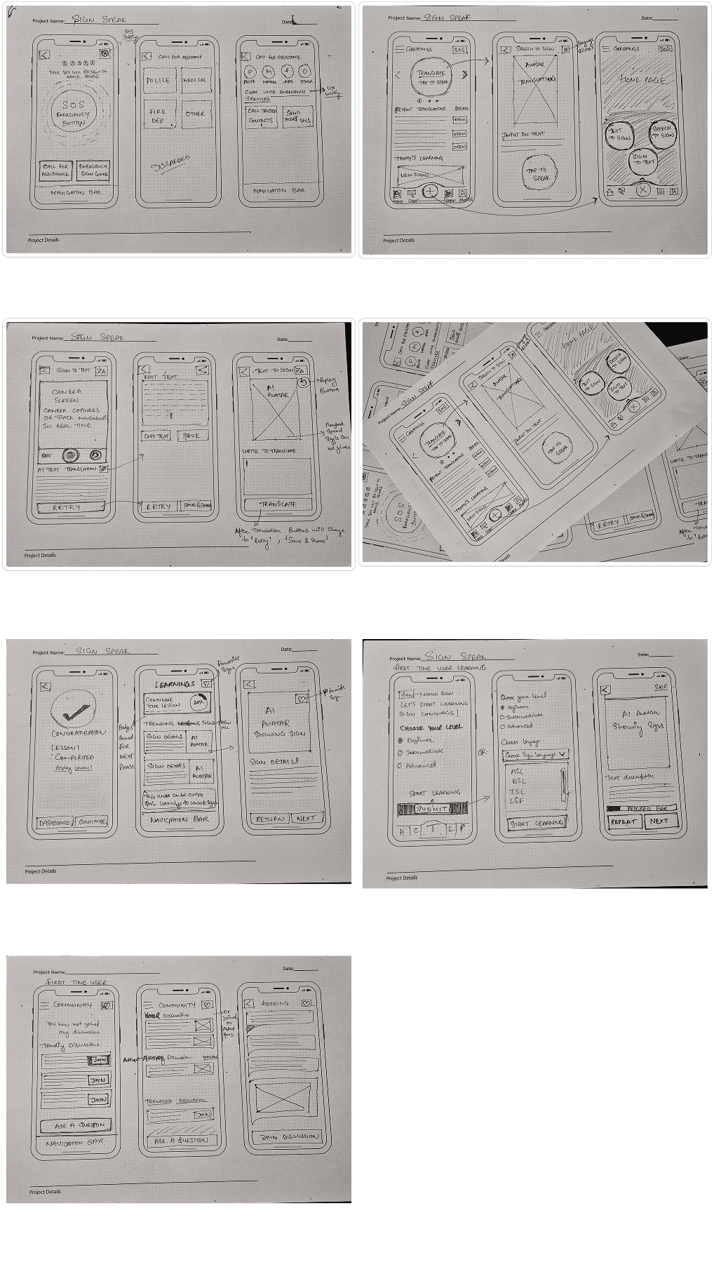
Paper before Figma.
Drawn on paper before opening Figma. Structure first, visual design second. The goal was to lock the information hierarchy and navigation pattern before committing to any visual decisions.
HIGHLIGHTS OF THE DESIGN
Sign → Text · the core flow.

The user opens the camera, lets the model see the sign, and reads the translated caption - with the confidence score visible. One-handed. Under the Doherty threshold. No silent failures.
HIGH CONFIDENCE
Pill turns teal at 90%+. Caption renders directly. No extra step.
LOW CONFIDENCE
Pill turns amber. Caption prefixed with "Best guess:" - the user can re-sign or override.
ERROR STATE
Camera blocked or hand out of frame → named status + retry CTA. No silent failure.
The most-used flow in the app. The user opens the camera, lets the model see the sign, reads the translated caption - with confidence shown. Designed so the target is one-handed, latency stays under the Doherty threshold, and confidence is never hidden. The CTA is the caption itself - it's the answer, not a step.
SCREEN-LEVEL DECISIONS
Main flows. The reasoning behind each.


For hearing speakers who don't sign - without learning to.




EMERGENCY DESIGN
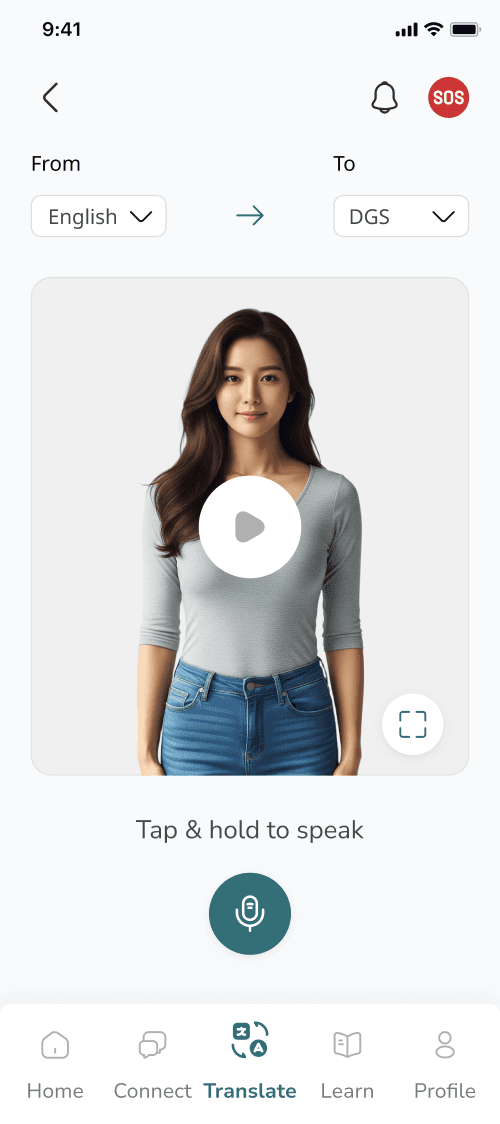
One tap, no words.
Designing for the moment speech is not an option.
WCAG AA on every state. A long haptic pulse confirms the alert was sent - feedback Deaf users can feel.

DESIGN SYSTEM & ACCESSIBILITY
Tokens, components, type.
Like a sign language, a UI has rules. Tokens are vocabulary, components are sentences, layout is grammar. Defined once, reused everywhere - so adding the 91st screen costs the same as the 1st.


COMPONENT LIBRARY

WHAT THE PRODUCT SHIPPED
Impact.
Component-driven system.
Enabled fast iteration across 90+ screens as a solo designer.
DGS-first language strategy.
Aligned with the German market and persona research; pushed against the industry's ASL-default.
UX-law mapping.
Made design decisions defensible to non-designers (jury of 3 professors).
5-tab nav.
Mirrors familiar chat apps - zero relearn cost.
Accessibility-led aesthetic.
High contrast and thumb-reach drove visual decisions, not the other way around.
Single-product coverage.
Real-time DGS + emergency SOS + community learning hub in one app, where the existing market had zero.
RESEARCH FOUNDATION
Cited inline, listed here.
Disabling hearing loss - global prevalence + 2050 projection. The scale that justified the project.
World Federation of the Deaf - emergency access barriers for Deaf citizens.
European Union of the Deaf - EU communication gap report; lip-reading fatigue.
Every persona quote, statistic, and design rationale in this case study links to one of these sources or the audit of Hand Talk / ProDeaf / Signily / Google Interpreter Mode.
Final Designs.
DGS-first translation, one-tap SOS, and a Deaf-community learning hub.
