
B2B OPERATIONS & DATA MANAGEMENT PLATFORM
Redesign of the internal operations platform used daily by Port of Singapore Authority teams - reducing error rates and driving broad team adoption within six months of launch. Metrics based on internal QA logs provided by PSA.
Timeline
2023–2024
Role
UX Research, Interaction Design, UI System, Developer Handoff
Platform
Web (B2B)
Client
The Port of Singapore Authority (PSA)
Team
Worked as sole designer embedded in a cross-functional team (PM, developers, QA)
TL;DR
• Problem
High error rates and low usability in a complex, data-heavy internal platform.
• Users
Buyer and seller operations teams at the client, working under high-pressure conditions where a single error can cascade into delayed shipments and financial losses.
• Key Challenge
Improving accuracy without disrupting existing workflows.
• My Role
UX research, interaction design, UI system, and developer handoff.
• Outcome
Reported ~35% reduction in operational errors and ~85% team adoption within six months of rollout, based on internal QA logs and stakeholder feedback from PSA. Exact figures are approximate - the platform is proprietary and external verification isn’t possible.
Context & Constraints
Slotxpert is an internal B2B platform used daily by operations and management teams at the Port of Singapore Authority (PSA) - one of the world’s busiest port operators - to manage large volumes of container slot booking and listing data across buyer and seller roles.
The platform handles high-stakes, time-sensitive transactions where errors carry direct operational and financial consequences. The legacy system being replaced was proprietary internal software, so before/after screen comparisons are not available. The case study instead documents the research findings, design decisions, and post-launch metrics that evidence the impact of the redesign.
The redesign had to work within several real-world constraints:
Existing users were already trained on legacy workflows
Large tables and dense datasets with a high risk of human error
Limited tolerance for drastic UI changes - adoption required familiarity, not novelty
Tight delivery timelines aligned with live port business operations
Dependency on existing backend logic and data structures
User Research & Baseline Survey Insights
The client provided internal survey data from both buyer and seller teams before the redesign. I worked with the raw data to identify patterns, refine the findings, and translate them into a clear problem definition. The charts below reflect my synthesis of this client-provided research.
The research focused on three dimensions:
Task completion confidence
could users complete key actions without uncertainty or second-guessing?
Error frequency
where in the workflow were mistakes most common, and what triggered them?
System trust
did users feel confident the platform had correctly recorded their actions?
Findings consistently pointed to the same friction points: dense data tables with no visual hierarchy, unclear confirmation states after critical actions, and inconsistent patterns across buyer and seller flows. Survey result summaries are shown below. These findings directly shaped the core problem definition outlined in the next section.


Source: client-provided survey summaries (~148 booking-flow users; ~147 listing-flow users). I synthesized and visualized the findings; I did not administer the survey.
Results showed that while most users could technically complete tasks, a significant portion reported hesitation, repeated checks, and low confidence - a system that functioned but created unnecessary friction at every high-stakes step.
This gap between task completion rate and user confidence became the core design brief: reduce errors and rebuild trust without disrupting workflows users had already been trained on. The post-launch metrics - ~35% error reduction, ~85% adoption - directly validate how well that brief was met.
The Core Problem
Users frequently made errors due to dense tables, absent visual hierarchy, and inconsistent feedback across critical actions - directly reducing operational efficiency and eroding trust in the system. The problem was not that users couldn’t operate the platform. It was that the platform gave them no confidence they had done so correctly.
At a major Asian port authority - one of the world’s highest-throughput port operations - every missed confirmation or misread data row has downstream consequences: incorrect bookings, misallocated container slots, and time-consuming manual corrections. Users compensated by double-checking every action, slowing down workflows that are inherently time-sensitive. The platform was creating a trust deficit that made careful operators slow and rushed operators error-prone.
The redesign brief was therefore not aesthetic - it was operational: make the system trustworthy enough that users could act with confidence the first time.
My Role & Responsibilities
I worked as the sole Product Designer on the Slotxpert redesign, embedded within PSA’s cross-functional team through Metafic, a design and technology studio. Metafic is no longer operating. Responsible for the full design process from research and diagnosis through to developer handoff. The primary constraint was designing improvements that existing users could adopt without retraining, while significantly reducing the operational error rate. What follows documents how that brief was approached and what it produced.
• Conducted baseline research: internal surveys with buyer and seller teams to identify error-prone workflows and usability gaps
• Audited existing workflows and mapped friction points across slot booking and container listing flows
• Redesigned information hierarchy across complex data tables and multi-step dashboards
• Defined role-specific IA for buyer and seller flows with consistent shared interaction patterns
• Designed interaction patterns focused on error prevention: confirmation states, progressive disclosure, and clear action labelling
• Built a consistent UI component system aligned with backend constraints and delivery timelines
• Managed developer handoff and collaborated closely with engineers to ensure implementation fidelity
Information Architecture & User Flows
Slotxpert serves two distinct user roles - buyers and sellers - each with separate but interdependent workflows. The redesign required two parallel IA tracks that shared consistent patterns while supporting role-specific needs.
Structural decisions focused on navigation and entry-point clarity - interaction-level decisions (confirmation states, error handling, progressive disclosure) are covered in the Key Design Decisions section below.
• Role separation at entry - clear routing from login based on user role, eliminating confusion from a shared dashboard with mixed-role content
• Task-focused navigation - primary actions (book slot, list container) surfaced at the top level, reducing the navigation depth required to reach core workflows
• Parallel flow consistency - buyer and seller flows were designed to share the same structural patterns, so users switching roles encountered a familiar system rather than a new one
Seller User Flow

Buyer User Flow

Wireframes & Layout Exploration
The client provided existing wireframes and flow references for the seller and buyer journeys. I used them to understand the established mental models, constraints, and expected states before restructuring the experience.
I treated these references as a starting point rather than final UI. I rebuilt the highest-risk interactions, slot booking for buyers and container listing for sellers, around the friction points found in the client data. The flows were then refined around one core question: can a user understand what to do next without needing instructions?
Seller Wireframes

Client-provided seller wireframes used as reference material.
Buyer Wireframes

Client-provided buyer wireframes used as reference material.
Wireframe Exploration

Key Design Decisions & Trade-offs
Error prevention over visual minimalism
Clear confirmation states, inline validation, and action feedback were prioritised over UI reduction. In a port operations context, a missed confirmation is an operational error.
Progressive disclosure for dense data
Large datasets revealed contextually rather than displayed in full - reducing cognitive load on screens handling hundreds of container records simultaneously.
Preserved familiar interaction patterns
Core workflows kept intentionally close to existing mental models. Retraining an internal operations team at this scale carries significant cost; adoption required familiarity, not novelty.
Accepted constraints imposed by backend logic
Certain ideal solutions were adjusted to align with existing data structures and delivery timelines. Design decisions were documented and handed off so future iterations could revisit them when backend constraints lift.
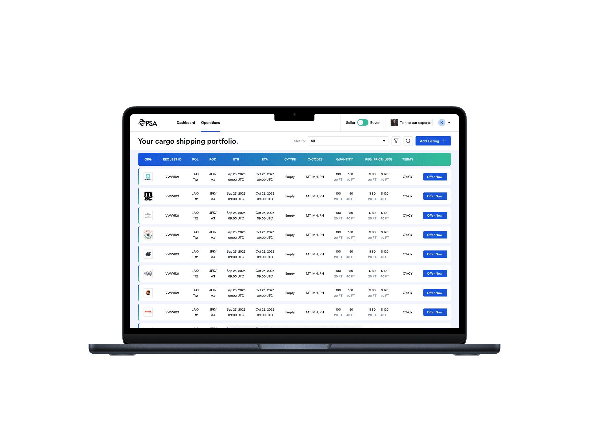
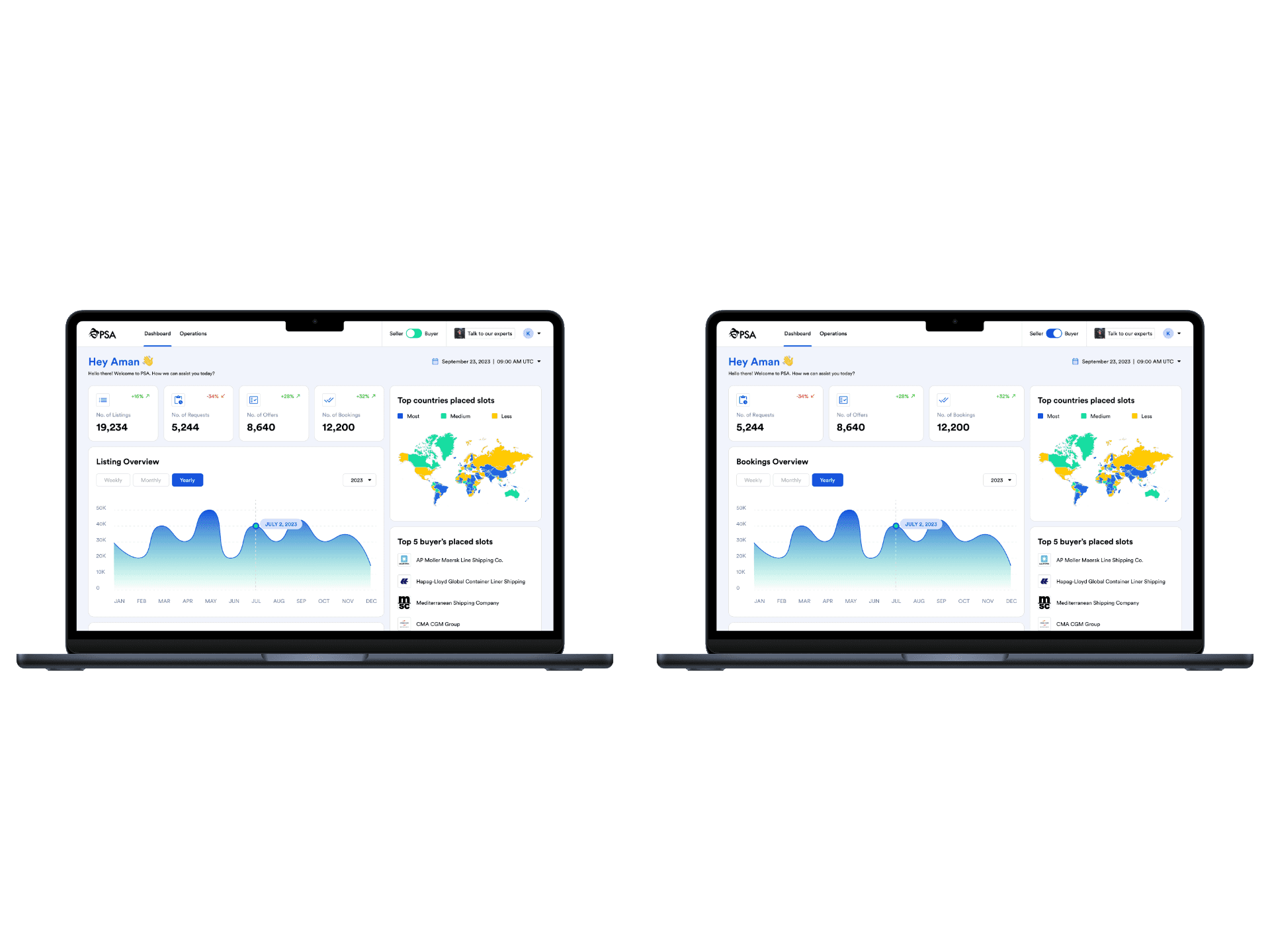
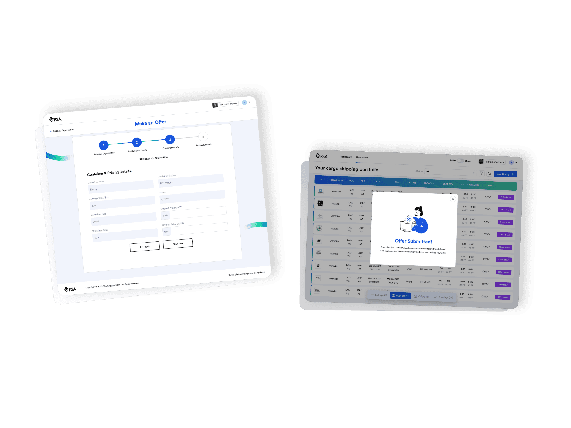
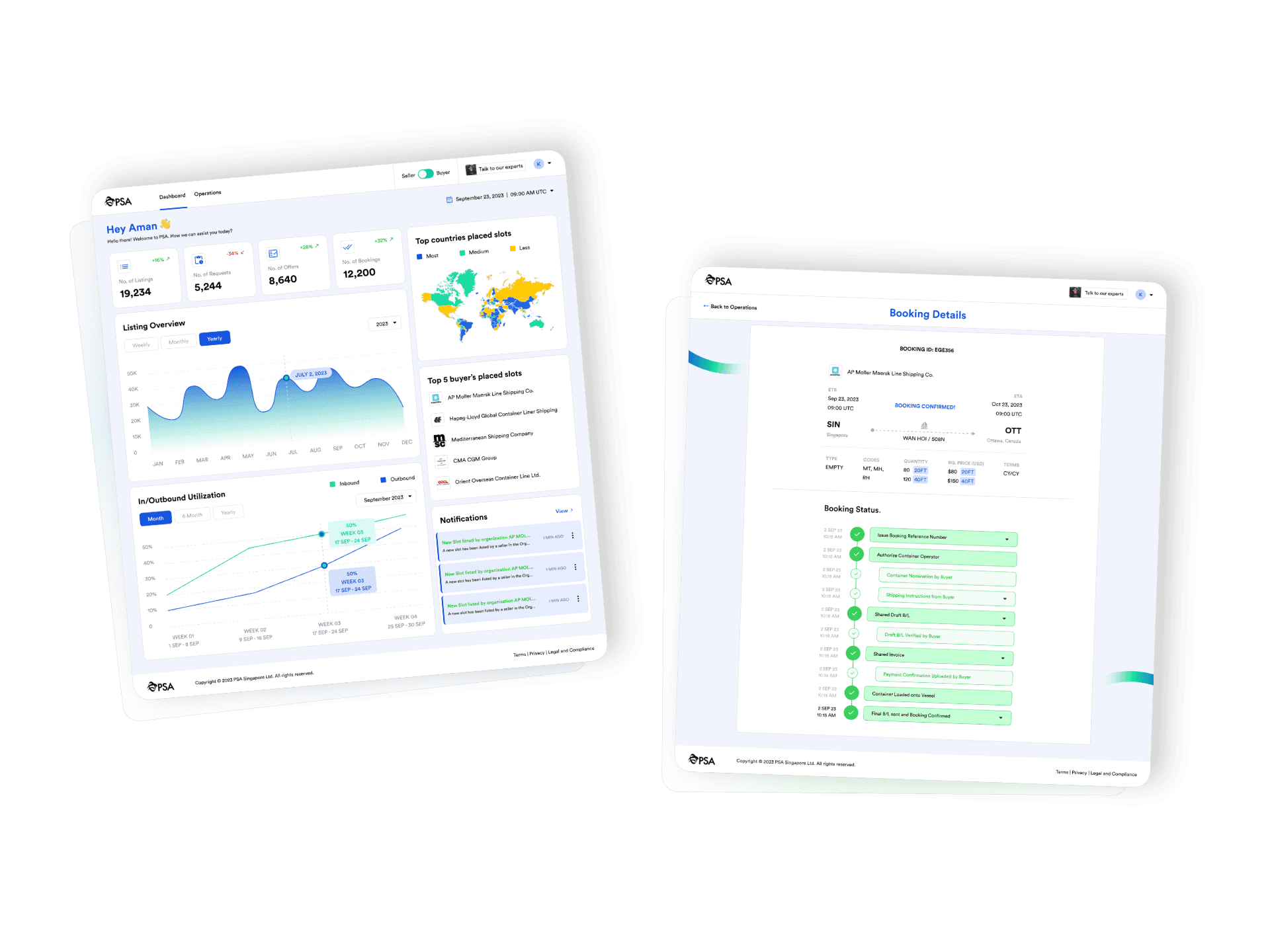
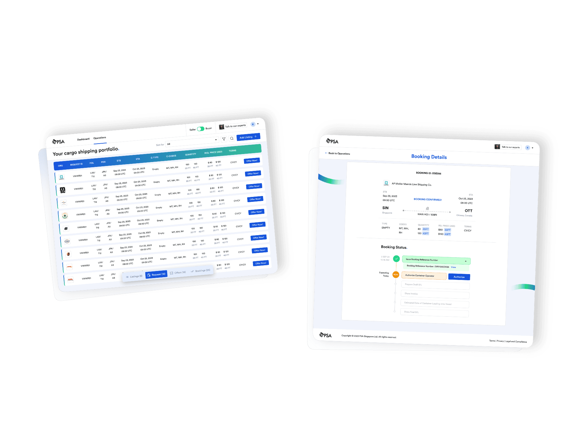
Final UI Screens
The final UI delivers a clear, role-specific experience for both buyer and seller teams - focused on error prevention, predictable navigation, and confident action across all high-stakes workflows. Familiarity with existing patterns was deliberately preserved to minimise retraining costs for internal teams.
Outcomes - based on client-reported data
Given the proprietary nature of the platform, post-launch internal metrics serve as the primary evidence of design impact:
• ~35% reduction in user errors based on internal QA logs over 6 months post-launch
• ~85% adoption across internal buyer and seller teams following rollout
• ~80% retention compared to the previous workflow version
• Reduced time-on-task for the two core workflows: slot booking and container listing
• Stakeholder feedback confirmed improved trust in system confirmation states - users stopped repeating actions out of uncertainty
All metrics are based on internal QA logs and stakeholder feedback collected over a 6-month post-launch period at the Port of Singapore Authority.
Limitations & Reflections
A few things I can’t fully evidence in this case study.
The platform is proprietary. I can’t share live URLs, real user data, or before/after comparisons against the legacy system - the legacy software was internal and no baseline screenshots exist.
The metrics came from the client. The ~35% error reduction and ~85% adoption figures are from internal QA logs the client shared with us post-launch. I didn’t collect this data myself and can’t independently verify it.
I’d push harder for moderated usability testing during the wireframe stage. We validated direction through stakeholder reviews, but I didn’t sit with actual buyer and seller users watching them navigate the new flows before hi-fi. The post-launch error reduction suggests the decisions were right, but I got lucky rather than rigorous.
I’d document the rejected directions more carefully. The Key Design Decisions table captures what we chose and why, but I didn’t keep records of the alternatives we ruled out during wireframing. That gap makes it harder to explain the trade-offs in detail now.
If I were doing this again, I’d maintain a portfolio-safe version of every screen from the start - anonymised, clean, and NDA-compliant from day one - rather than retrofitting it at the end.
In B2B systems used daily for high-stakes operations, predictability and trust matter far more than visual novelty. Users need certainty that the system did what they intended - not just that it looks clean.
Working within legacy constraints - backend logic, existing data structures, trained user habits - pushed me toward incremental, evidence-based improvements rather than wholesale redesigns. The result was stronger adoption because users recognised the system while experiencing it as meaningfully better. Designing for change adoption is a different skill from designing for first impressions.
The ~35% error reduction came from consistent application of error-prevention principles across dozens of small interactions. No single decision moved the metric - it was the compound effect of confirmation states, visual hierarchy, progressive disclosure, and clearer action labels applied consistently throughout.